This is a premium feature available with Astra Pro Addon plugin. To use these Pro features, you need to have the Astra theme along with the Astra Pro Addon installed on your website.
Note:
You would not find the Above Header Section separately if you are above the Astra version 3.0.0. You will need to visit the Header Builder section and edit the insert elements to the first row virtually. Learn more here.
It appears above the primary header. It helps to show a call to action button, contact details, social media icons, menu, etc. Make sure you have activated Header Sections module from Astra Pro.
Above Header Layout
Astra provides two layouts for Above Header.
Above Header Layout 1
It will display section 1 to the left side and section 2 to the right side.
Above Header Layout 2
It will allow you to display only one section at the center of the above header.
Section 1 and Section 2
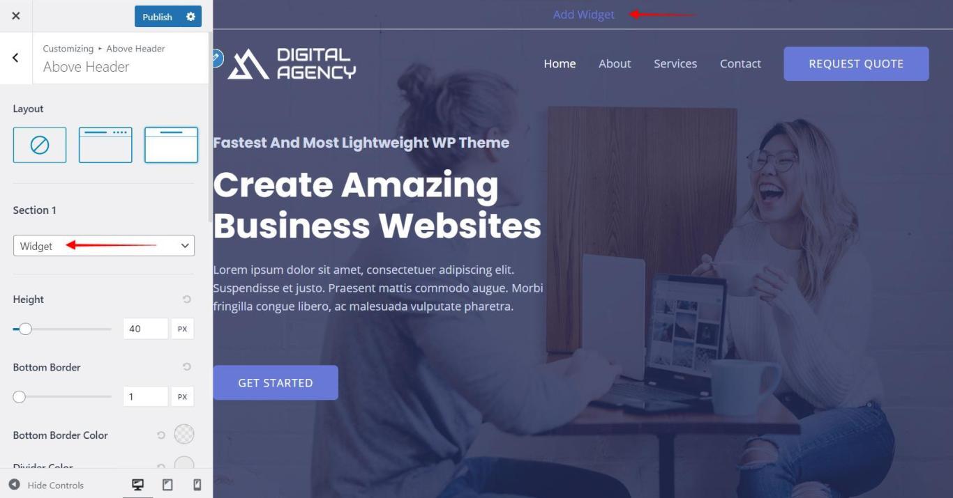
You can put content into two different sections in above header. You can choose options for each section from drop down.
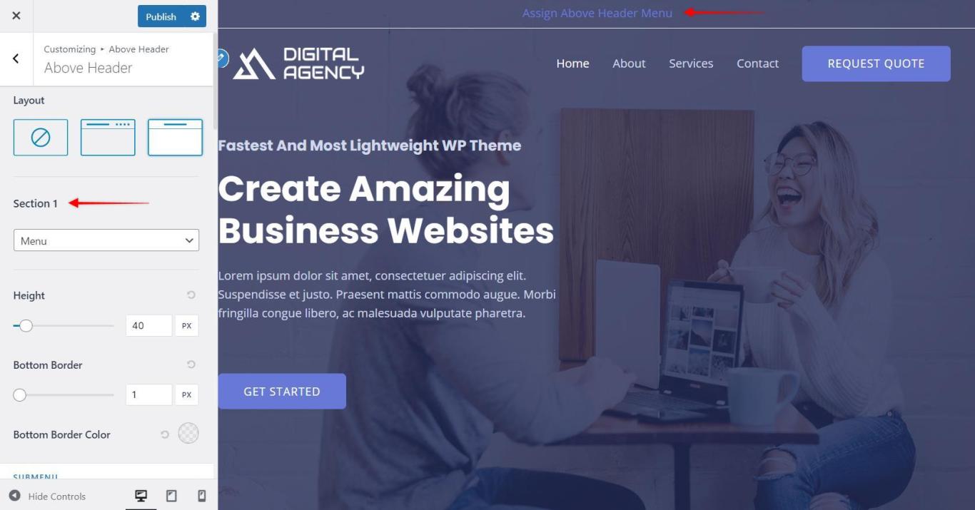
Menu
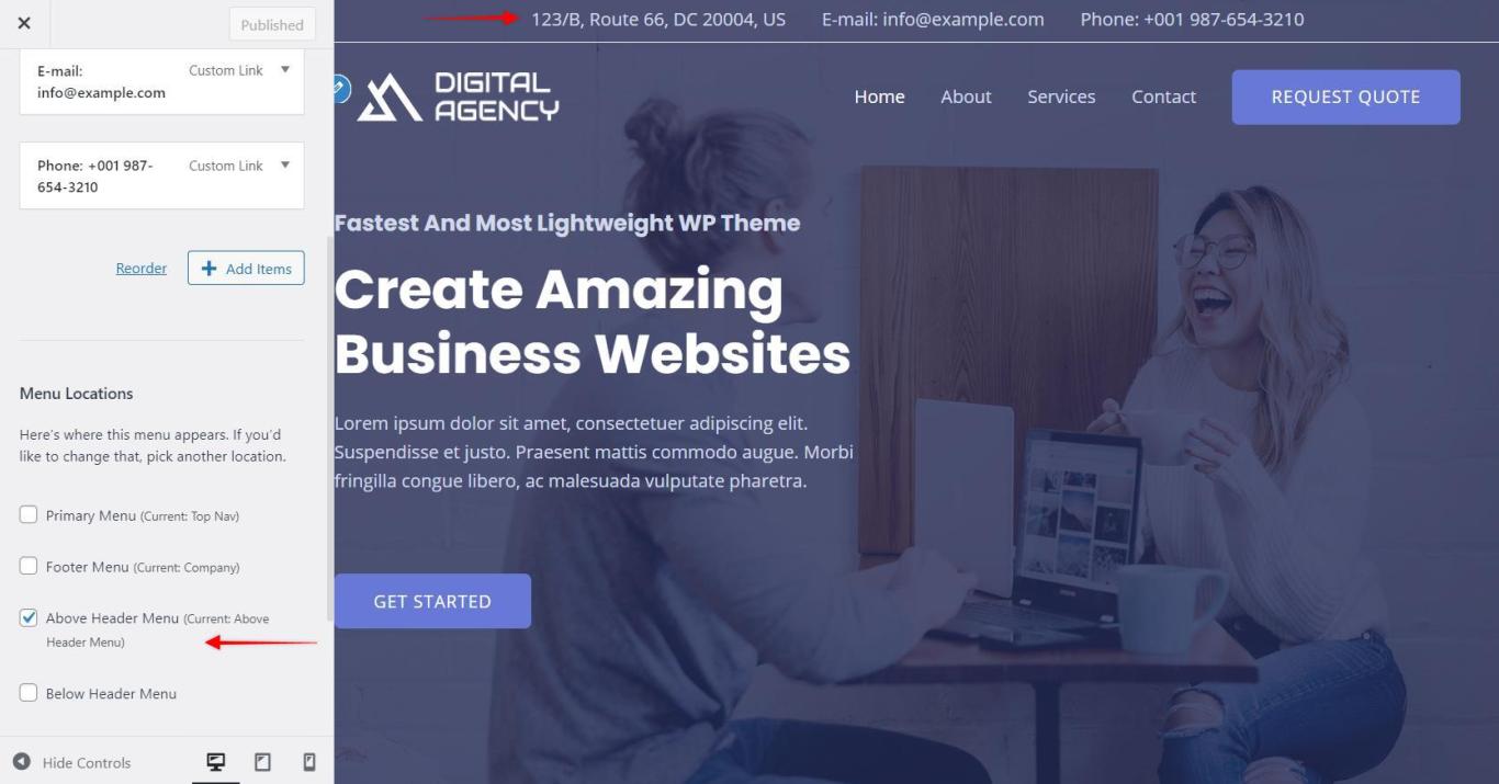
You can display menu in the above header with this option.
You would need to create a menu under Appearance > Customize > Menus > Create a new menu and assign it to above header menu.
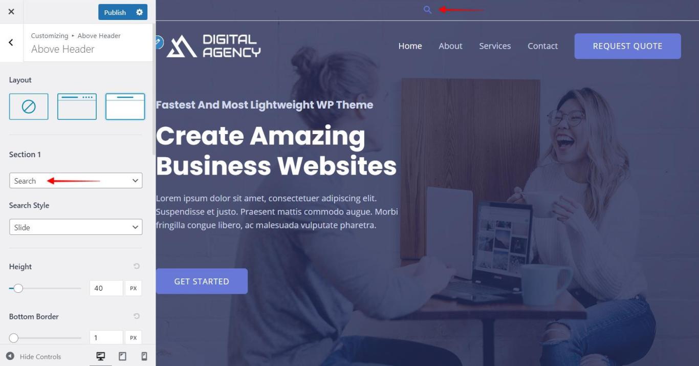
Search
It will add a search icon for a search box. When you click on the icon, the search box will appear.
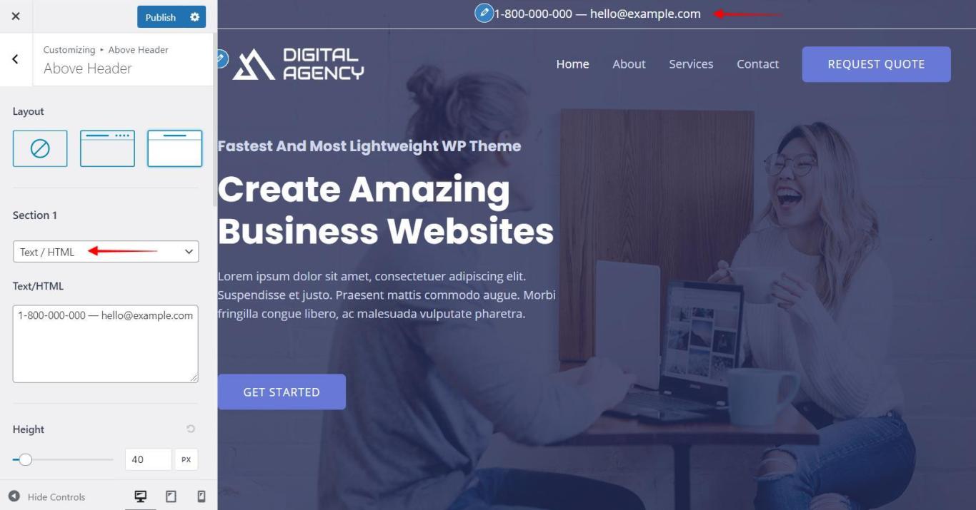
Text / HTML
It will allow you to insert text and HTML code. You can insert a call to action button, contact number, email address etc.
Widget
You can add a widget to the above header with this option.
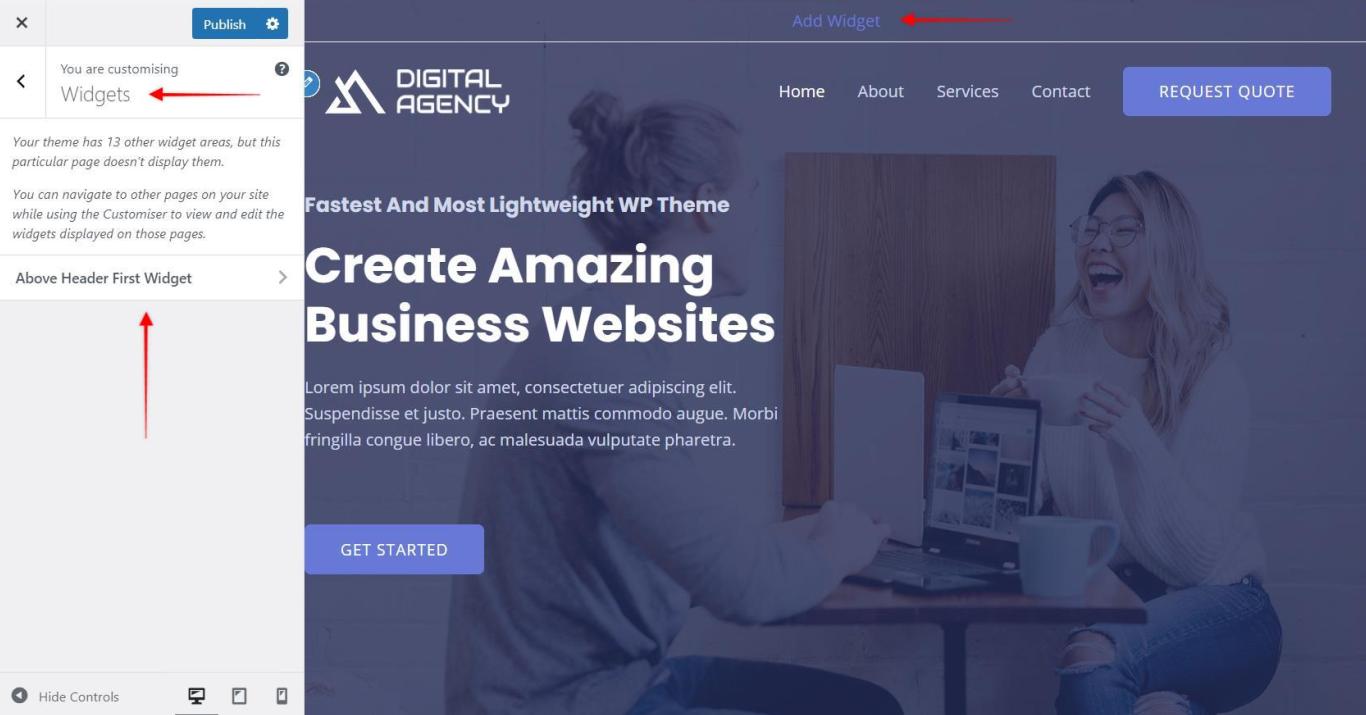
After selecting the widget option, you will able to set a widget from:
Appearance > Customize > Widgets
Choose any WordPress default widget or you can use any third party plugin to add a widget to the list.
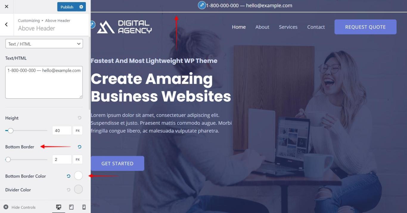
Above Header Bottom Border Width and Color
You can set a bottom border for an above header with this option. Set a border width and then set a color for it.
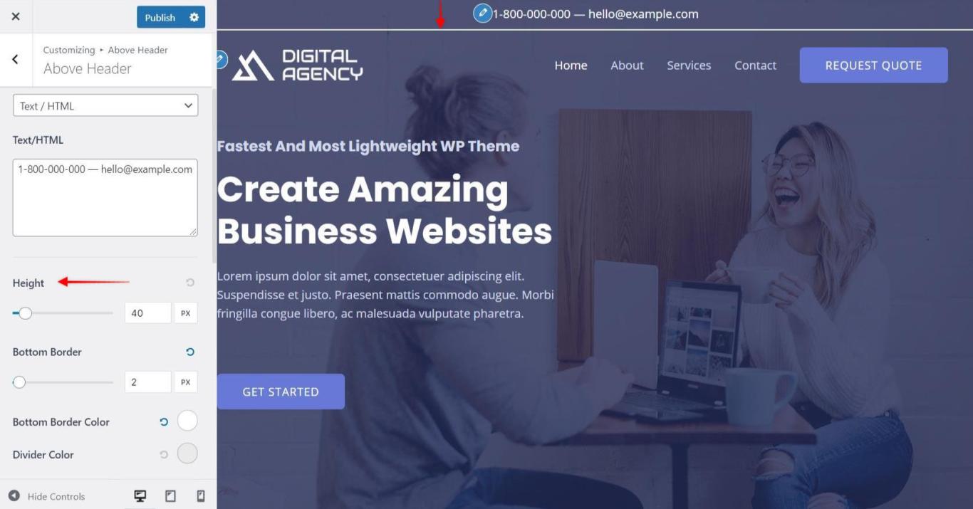
Above Header Height
You can easily set height for the above header with a slider.
Mobile Header Alignment
It allows you to set the alignment of section 1 and section 2 on mobile devices. You can choose it to be Inline or Stack.
Menu Label on Small Devices
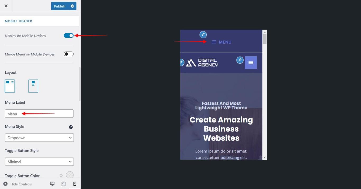
If you have selected a menu to be displayed in section 1/ section 2, it will appear as a hamburger menu on mobile devices. You can set a label for this menu.
Merge menu with primary menu in responsive
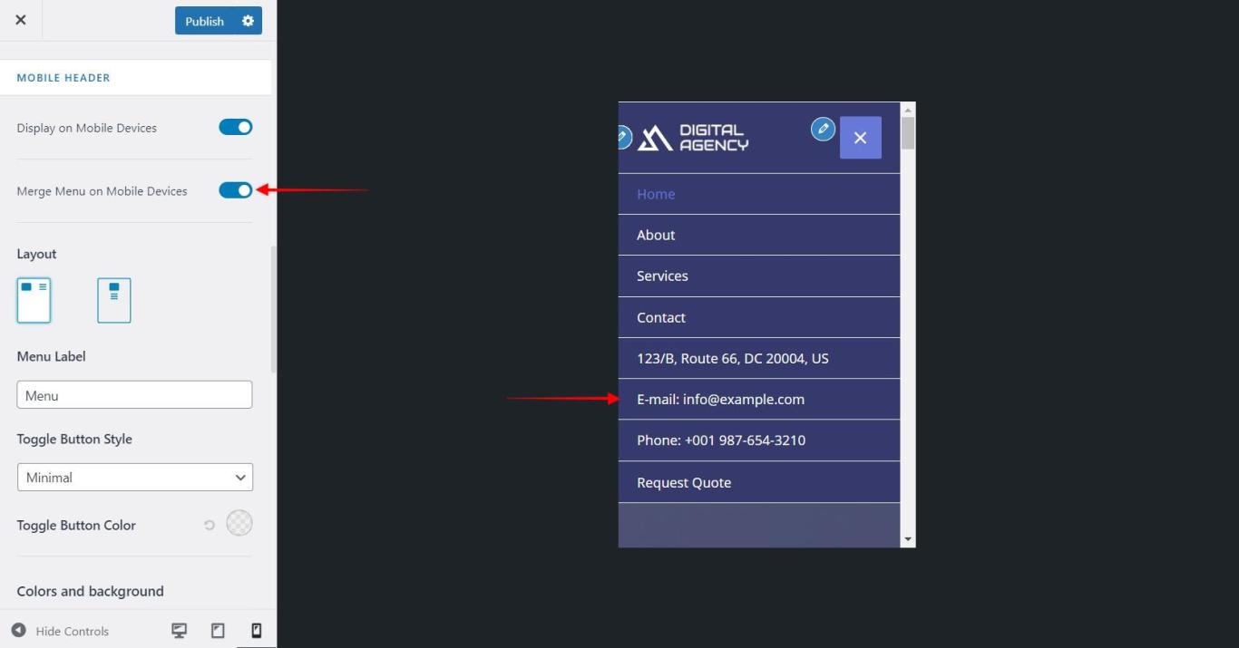
This allows you to merge your above header menu (set with section 1/ section 2) into a primary header on the mobile device.
Colors & Background options for Above Header
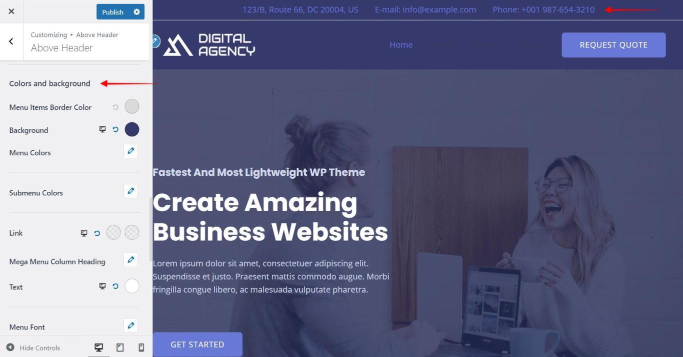
You can set background and content color for Above Header from Appearance > Customize >Header > Above Header
You can set the following colors from available settings
- Background Color
- Content Section
- Text Color
- Link Color
- Link Hover Color
Related Document –


